
From one of my scamps ideas I then drew separate parts of my album. This allowed me to experiment on how I want the album to bee seen. I then copied my favourites and developed them until I was happy to ink.

I then inked over the images to create a new page of images.


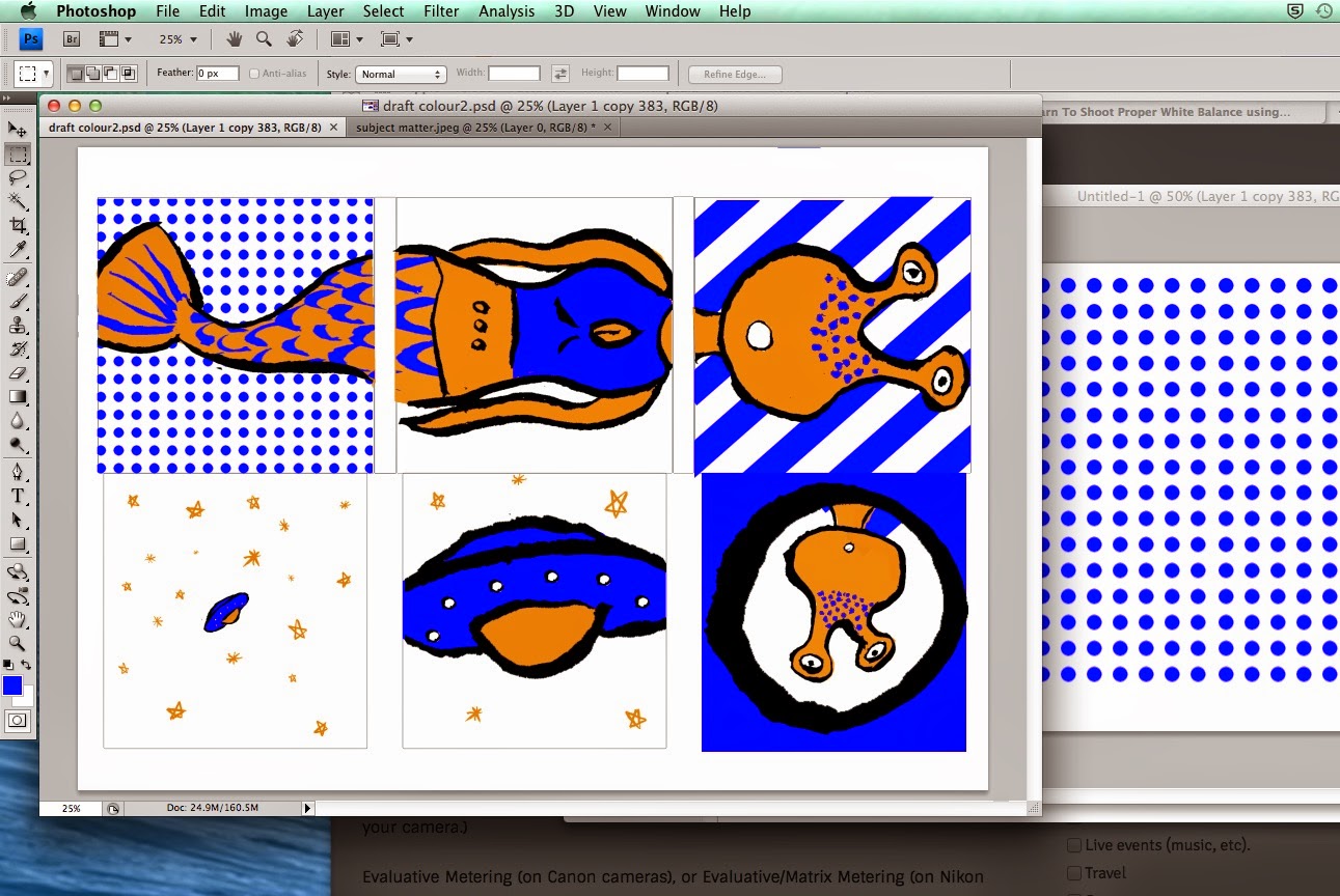
I first created a draft of the elements on the page into my layout which I had created earlier for my scamps.

Once I had decided on my layout I then added colour. I did this by adjusting the colour on the scan. I chose a complementary colour scheme as I needed three screens, which are an orange, blue and black layer.

After this I noticed a problem, the orange on the fish tale is that it is above the blue layer which would not be possible in a screen print. I then had to re evaluate colours and see if I could add transparency or the design.


I added the scales this really helped with the design. To combat the white space I added strips and dots by creating a pattern in photoshop.
I then created 3 seperate images for each screen in my print.


Orange

No comments:
Post a Comment