Tuesday, 3 June 2014

Experimenting with mediums

I decided to look a different mediums that I could use in my final piece.

Adam Turman Copy

I found Adam Turman in a Gig Poster Book. I liked his unique stele of using what seemed like brush lines in screen prints. 

I decided to replicate this due to it's unusual lines and use of colour scheme. 

As we do not have a screen printer I used a similar style to my Aspect to Aspect piece. I first inked the line and then the parts in  Blue.


After scanning onto photoshop I increased the threshold and removed all the white elements


Before placing them all in one document I coloured them and placed them in separate layers so that it would be easier to move when in placed together.

I then aligned the images and started removing any unwanted lines or splashes from inking.


Monday, 2 June 2014

Adam Turman Email

For some research towards my personal Study I contacted Turman about screen printing.


Saturday, 31 May 2014

Adam Turman Emulation

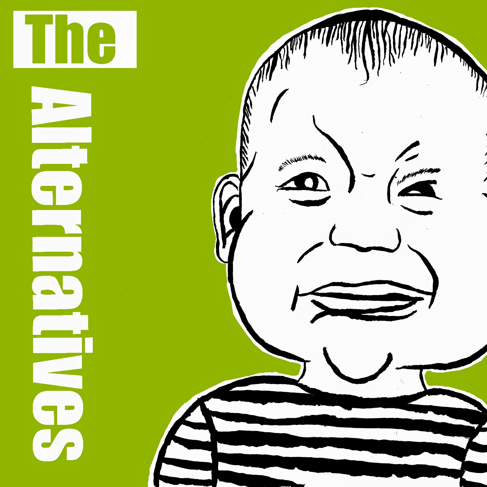
 After copying a piece of Turman's work I decided to create my own piece for an album cover. I chose an image of a baby through references of lyrics within indie songs as well as babies on album cover such as Nirvana.

I did some drawings before I started my piece.

I first copied an image I found on the internet and emphasized it's features. I then inked the image and moved the inked picture around to change the framing.

I experimented with the t-shirt so that it would have a similar style to Turman with the contrasting black and white.


Once I scanned in my work, I adjusted the threshold so that there were just light and dark area.

I then separated the image into to layers so that I could adjust them individually

I then placed them into a new documents and adjusted the size and space of the images

I then used then used the pen tool to select around the baby where I wanted to colour.

I looked at a range of colours. I liked the lime green colour due to the contrasts and warm colour.


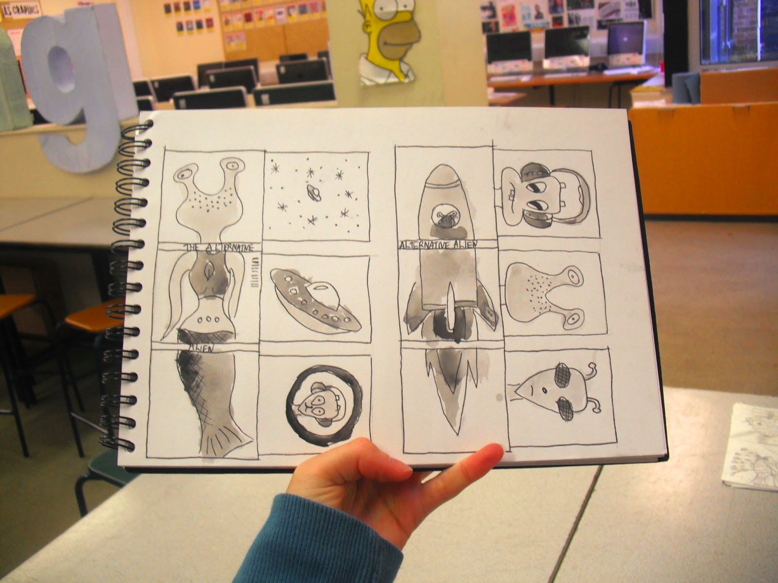
Drafts

Album Cover
These are my drafts, I used two of my previous scamps that I liked. I developed them until I felt that I would be happy to create them as a final piece. I used water colours to add tone within the drafts.


Album Sleeve


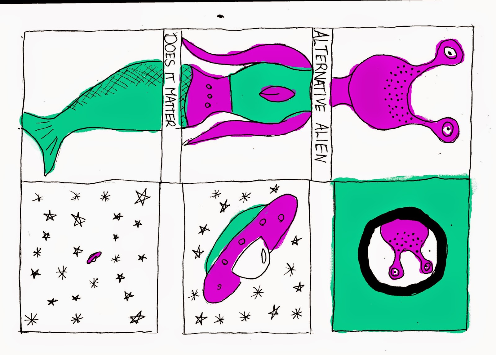
Colour Schemes


I also coloured the in Photoshop to evaluate what kind of colour scheme I wanted

Triadic Colour Scheme 
Analogous Colour Scheme
 Complementary Colour Scheme


From this I will probably try to have an analogous or complementry colour scheme as it makes the illustration more abstract adding to the bands name "The Alternatives".


Friday, 30 May 2014

Vector

From my expermentation with Mediums I felt I needed to look at vectors which I made in Illustrators. I first looked at a 2D vector which I felt looked good in childish view point.

I then made the image 3d by adding shading creating depth.


Logo Design (Typeface)

My emulation was not as great as I wanted because of the sans serif typeface. I decided to improve this by creating my own script type. 

I used pinterest to look at chunky script typefaces as will as other band logos


Follow Joey Mcaleese's board Typeface on Pinterest.


I first Brainstormed different brush strokes within letters.

 I then neatly inked out every letter in lower case and capitals. I did the typeface twice so I could choose the best.


Once I scanned in typeface, I altered the threshold and removed the white. This allowed me to easily move the letters into a new document.

I then placed both my capitals and lower case into one document so that it was more appealing. I grouped them into rows so that the document could edited and be moved.

This is my final piece. I like this due to the contrasting line size caused by the brush. It could be developed further by maybe trying out vectoring.

Typeface in Emulation

I felt my emulation did not portray the artist due to the sans serif typeface so after producing my own I placed it back into my emulation.

From my typeface, I placed this in photoshop I used a variety of caps and lower case to create the unique logo as well as contrasting the words in black and white.

I then placed this on my previous emulation and experimented on how I the text could be seen. The top left seemed to have too much white space where as the bottom two used white space but were hard to view. I felt the top right was the most appealing as it contrasts with the grid drawing attention towards the Logo.

I then edited with colour making some of the text green and some black.

I still did not enjoy this as the text conflicted with the inked drawing. I therefore created a perimeter around the typeface.

Here is the final product.


Wednesday, 28 May 2014

Further Colour schemes

I decide on the alien album cover due it's unique style. From my previous experimenting I looked a complementary colour schemes, due to the space context I felt that blue and orange worked best for it's context.


Album Sleeve